Data, data everywhere! Pharma is no different in that regard but does your data provide more than information or, worse, distracting noise? Data is necessary but what we really need is insight, defined as “a clear, accurate and deep understanding”. At Hawk Pharma Consulting we believe that insight is the bedrock …. On that we build objectives, then strategies, then plans to tactically execute – all neatly aligned.
If we don’t have the insight then we may be doing things right, but we may not be doing the right things. In the words of Sun Tzu, “tactics without strategy is the noise before defeat”. A good strategy is based on insight. It’s important to remember Pareto’s well-known 80/20 principle (virtually always holding true!) which illustrates how important it is to focus our efforts on the areas of greatest opportunity or return. Insight is at the core of these decisions.
A 2×2 grid is a simple, flexible and visual way of communicating key information and helping make good decisions; a few examples of this follow.
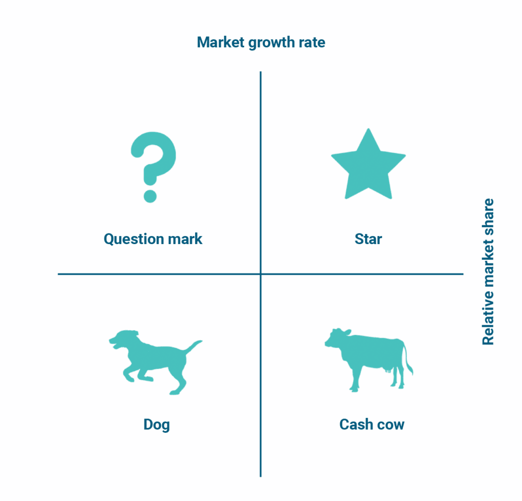
Boston matrix and strategic review of an established brand:
The Boston matrix is a simple and elegant tool.
We show the classic version here; market share for the company is plotted against market growth and products defined as dogs, question marks, cash cows and stars.
But the classic can be, and may need to be adapted ….
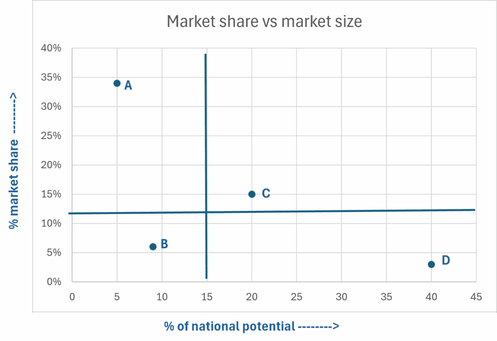
National marketing strategies:
On to a real example where, for this mature brand with several indications, we adapted the Boston matrix. We focused on market share but looked at it against market size in this stable therapy area.
The company had focused its time and money on indication A and gained 35% market share but, in reality, it was their smallest segment of the market with only 5% of the total potential. By contrast, indication D had only 3% market share yet eight times the potential – this segment had been largely ignored. They had some recent success in indication C. We named the segments: A was “maintain”, C was “develop” and D was “grow”. B was an area to “ignore”.
Insight: at a national level, indication D could dramatically change the growth and size of the brand. Indication A was towards the end of its growth phase. With this insight the objectives were changed focusing on D and C for growth. Strategies changed. Tactics and materials aligned to them. In area A, it was a “maintain” the high market share brief and remote tools were used with the sales team focused on driving growth in D & C.
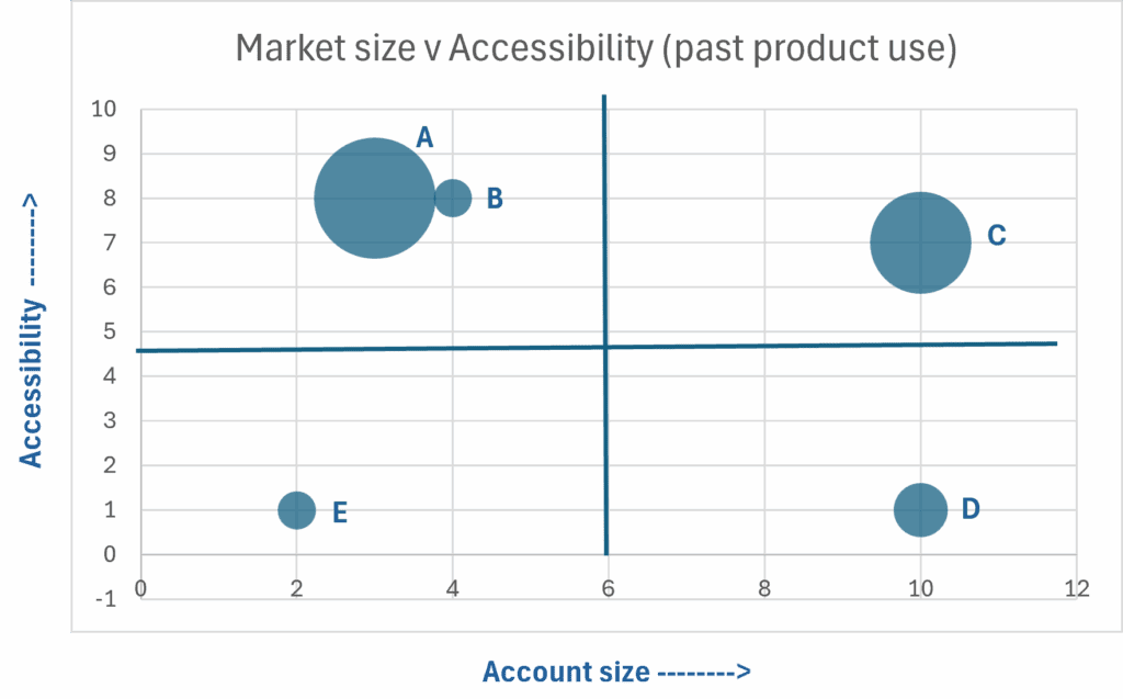
Sales strategy:
In another example, at launch of a brand, the marketing strategy was set but with limited sales resource, accounts had to be prioritised. Market size differentiated them but, as a launch product, market share was zero. With the client we agreed a variable of “accessibility”; this was not a measure of how easy customers were to see but how accounts had taken up similar products at launch in the past. Market size and accessibility became our two axes. The company had an existing product and use of that brand was seen as another positive factor. To enable us to visualise that we moved to a bubble chart where the size of the bubble indicated the size of the established product.
Most people would agree that a large account size with good accessibility is priority 1 and these became gold accounts (account C here). A company then has a commercial decision; what is more important to them? The options are quick results (high accessibility – like A or B) or large size (high potential – like D). If we assume that the company decides it needs quick wins then that is the segment with accounts A and B – silver accounts. Both are moderate in size and both have good accessibility but account A has an additional benefits of prior experience of the company’s products. Account D was big but a slow-burn and could be designated bronze.
Sustainability:
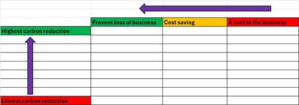
It’s not just marketing and sales decisions that are aided by keeping it simple. A good recent example was in the area of a carbon reduction plan where the question had been raised, “where do we start?”.
The first job was benchmarking what CO2 was generated by which activities – these were ranked on the left. Part two was to understand the cost of correcting or improving that carbon emission. Some changes would actually save money as well as carbon emissions, some would avoid future loss of business so both had a positive business impact. Others were good for environment however they did have a negative financial impact.
The client decided that they could not lose business so prevention of business loss became priority one. Cost saving was priority two. From a simple grid displaying carbon impact and cost of correction they made clear business decisions. Start with the high carbon reduction impact items that prevent business loss or are cost saving. The added bonus is that this was a relatively simple sell to CEO and CFO!
Summary
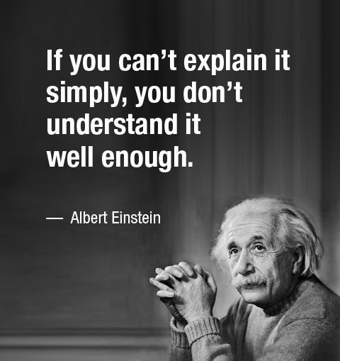
These are a few examples that illustrate that data, if presented simply and graphically, can give great insight. That insight can then be used to make transparent and reasoned business decisions which is what we want. Einstein’s words hold true in reverse – if we can explain it simply, we understand it. That is the basis of all good decisions.
Sometimes, if you don’t see the subject matter every day it is easier to ask the key questions and focus on the things that will make the difference. A classic example of seeing the woods, not just the trees. If you need some clarity with a decision or a second opinion then the team at Hawk Pharma Consulting can help – please get in touch us to set up an initial appointment with no obligation. Drop us a line at our email info@hawkpharmaconsulting.com